mapsDay 1 – Points – U.S. Credit Unions
Day 1 - Points
Challenge Description: Visualize point-based data such as individual locations, points of interest, or clusters. Focus on symbolization and density representation.
My Submission
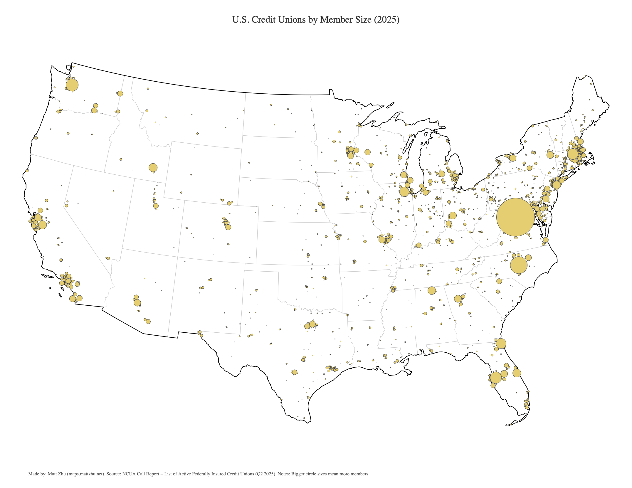
Maps visualizing U.S. credit unions, where each packed circle represents a credit union.
-
Circle size corresponds to member size.
-
Circle color indicates member growth rate — blue for higher growth, red for lower or negative growth.
 Click here to view high-quality PDF ⬆️
 Click here to view high-quality PDF ⬆️
Local Competition Between Big and Small CUs?
It’s interesting to observe that within clusters of neighboring credit unions, larger institutions (shown as bigger circles) tend to grow faster than smaller ones. This pattern raises the question of whether local competition plays a role—perhaps larger credit unions, with greater resources and brand recognition, are better positioned to attract members and gradually displace smaller competitors.
To explore this idea, I ran a simple state-level fixed-effects regression:
felm(formula = log(growth_4q + 1) ~ log(members) | state | 0 | state, data = df)and the results:
Coefficients:
             Estimate Cluster s.e. t value Pr(>|t|)
log(members)   0.1234       0.0266   4.639 2.47e-05 ***
Regression results show that the elasticity of member growth with respect to credit union size is approximately 0.12.
This means that, holding state-level effects constant, a 10% increase in membership size is associated with about a 1.2% higher growth rate over the past four quarters.
The coefficient is positive and statistically significant (p < 0.001), suggesting evidence of a scale advantage among larger credit unions.
Should smaller credit unions consider adopting efficient marketing intelligence to stay competitive and survive?
References
-
Source Data: NCUA Credit Union Call Report Data
Made by Matt Zhu for the #30DayMapChallenge.